Driving product discovery through new Dolby product recommendation tool
At a Glance
User experience optimization for Dolby's first digital product recommendation tool, while balancing marketing and user goals.
Role: UX Researcher (collaborating with 1 research partner)
Challenge: Copy prioritized brand positioning/education over user clarity, risking low completion rates
Impact: Achieved over 90% tool completion rate, prompting global deployment and establishing a new research partnership
Business Challenge
The marketing team launched a quiz-based tool to provide users with personalized recommendations for Dolby-enabled TVs and soundbars.
The copy in the initial prototype tried to fulfill multiple goals: educating users about Dolby’s technology, using a playful tone to reinforce brand positioning, and guiding users through the quiz. My fellow UX researcher and I suspected this would introduce friction and reduce completion rates.
Research Goals
Assess how clarity versus brand-focused messaging affects user comprehension and completion of the tool
Identify navigation and interactivity issues that could impact completion
Approach
We anticipated that users would struggle with copy after reviewing the initial prototype, so we spoke to the team about changing the copy prior to testing. However, the team was concerned about losing a playful, educational tone tied to positioning Dolby as a trusted advisor.
Given a one week timeline from kickoff to reporting, we conducted moderated usability tests (12 sessions, half moderated by me) with the ability to rapidly iterate copy mid-study. This approach allowed us to:
Observe and probe on real-time user confusion and comprehension issues
Leverage real-time user confusion to quickly build consensus on clarity vs. brand tone with the marketing team
Test revised copy immediately rather than waiting for a second study
Deliverables
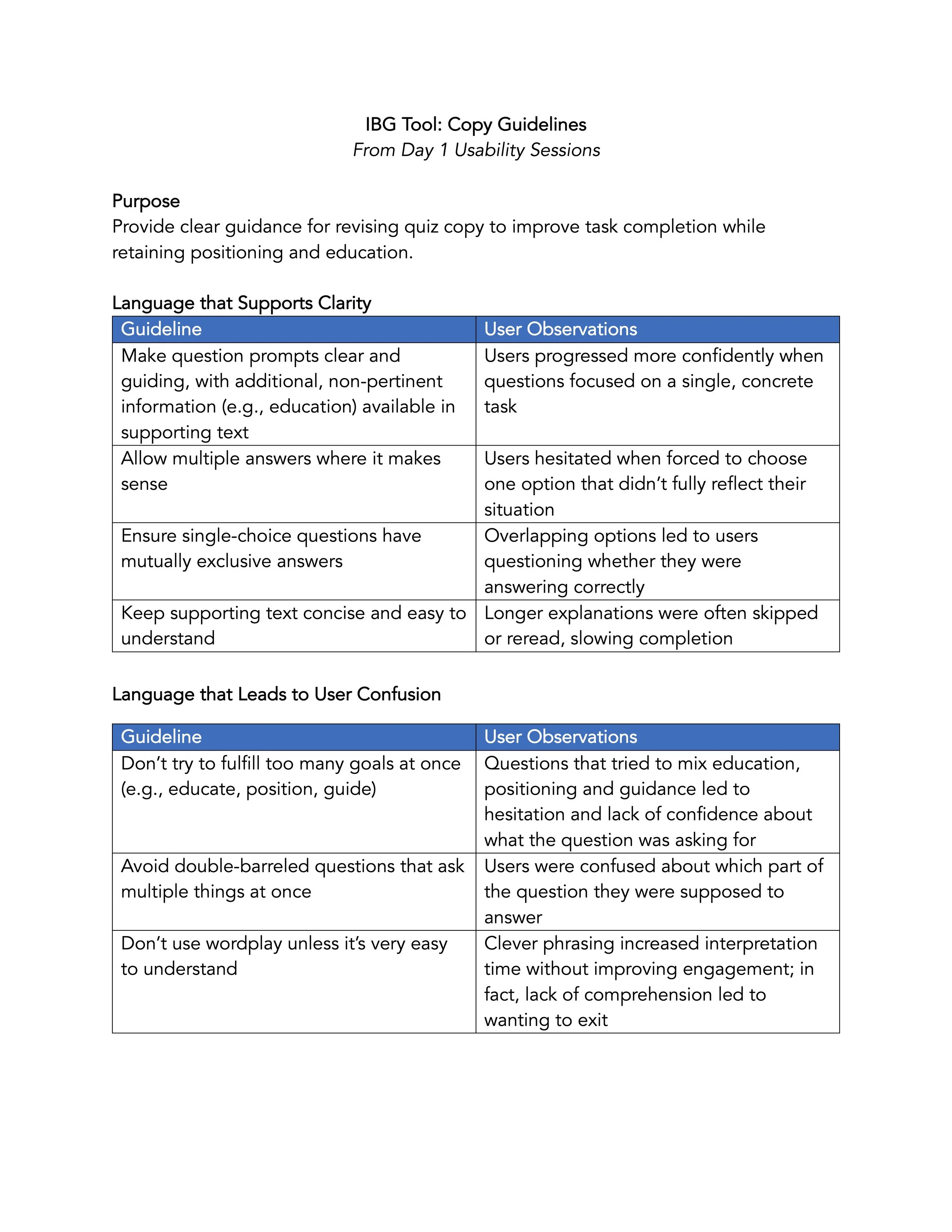
Mid-study: I developed concise copy guideline document to improve task guidance; all remaining sessions were conducted using the updated copy
After study: We collaborated on a final report with all findings, including recommendations for design and copy
Original → iterated text
Copy guideline document
Prototype tested (after text iterations)
Key Learnings
Clarity not only improved task completion, but also strengthened the "trusted advisor" positioning by making the tool feel authoritative and easy to use. Participants who clearly understood the questions and response options also reported greater confidence in the recommendations.
Separating copy goals across text layers improved flow. Using the Q&A text strictly to guide task completion, while reserving supporting text for education about Dolby’s technology, reduced confusion and improved progression through the tool.
Final product recommendation tool after implementing research findings
Impact
The improved experience led to strong engagement: over 90% of users reached the recommendation results page. Based on this performance, the tool launched globally on Dolby’s main site after its initial success on the UK campaign page.
The results also demonstrated the value of user-centered decision-making within a low-UX-maturity marketing organization, leading to multiple follow-up UX research initiatives with the same team over the following year.
Reflection
With more time, I would have tested the copy independently from the UI earlier in the process. Isolating the text would have enabled more focused discussions about tone and clarity before integrating it into the final design.
This project reinforced the importance of choosing research methods that balance speed, rigor, and stakeholder constraints—especially when research is needed to inform high-impact content decisions.


